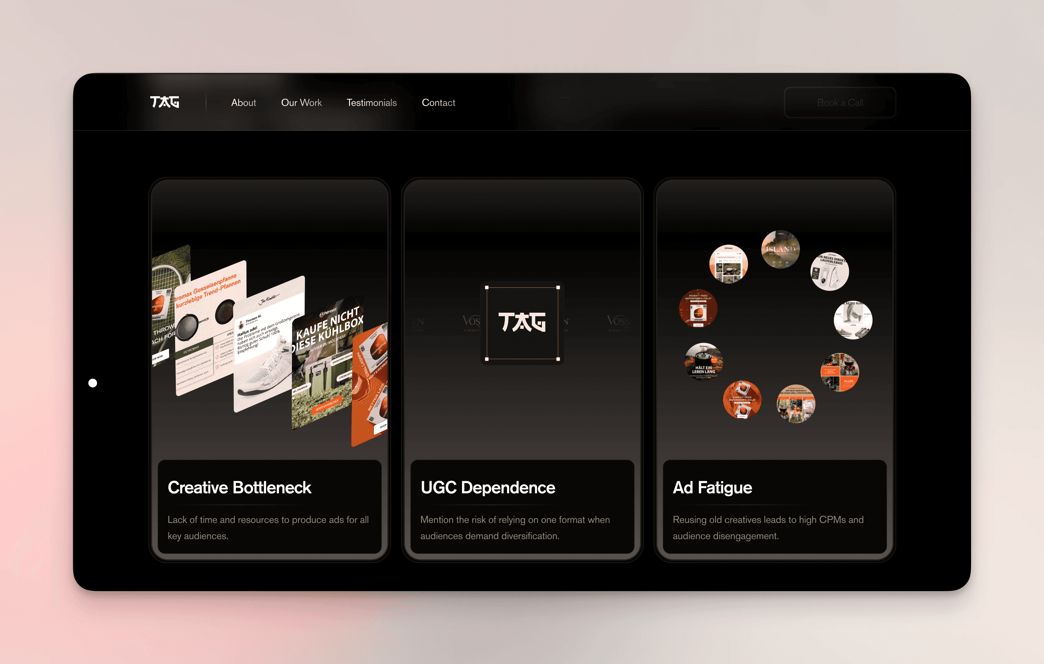
The AdGency had just gone through a redesign—but it missed the mark. It lacked energy, didn’t reflect their bold brand, and wasn’t converting. They needed a site that looked as sharp as their work and helped close clients. The new site was built in Framer from the ground up. A dark, moody palette with bold accents, clean type, and a subtle samurai-inspired visual language gave it edge and personality. Motion and interactivity brought it to life, while dual CMS setups (for projects and policies) made it easy to manage in-house. The process was fast and collaborative, and we wrapped up weeks early. Now, The AdGency has a site that finally feels like them—distinct, dynamic, and built to convert.