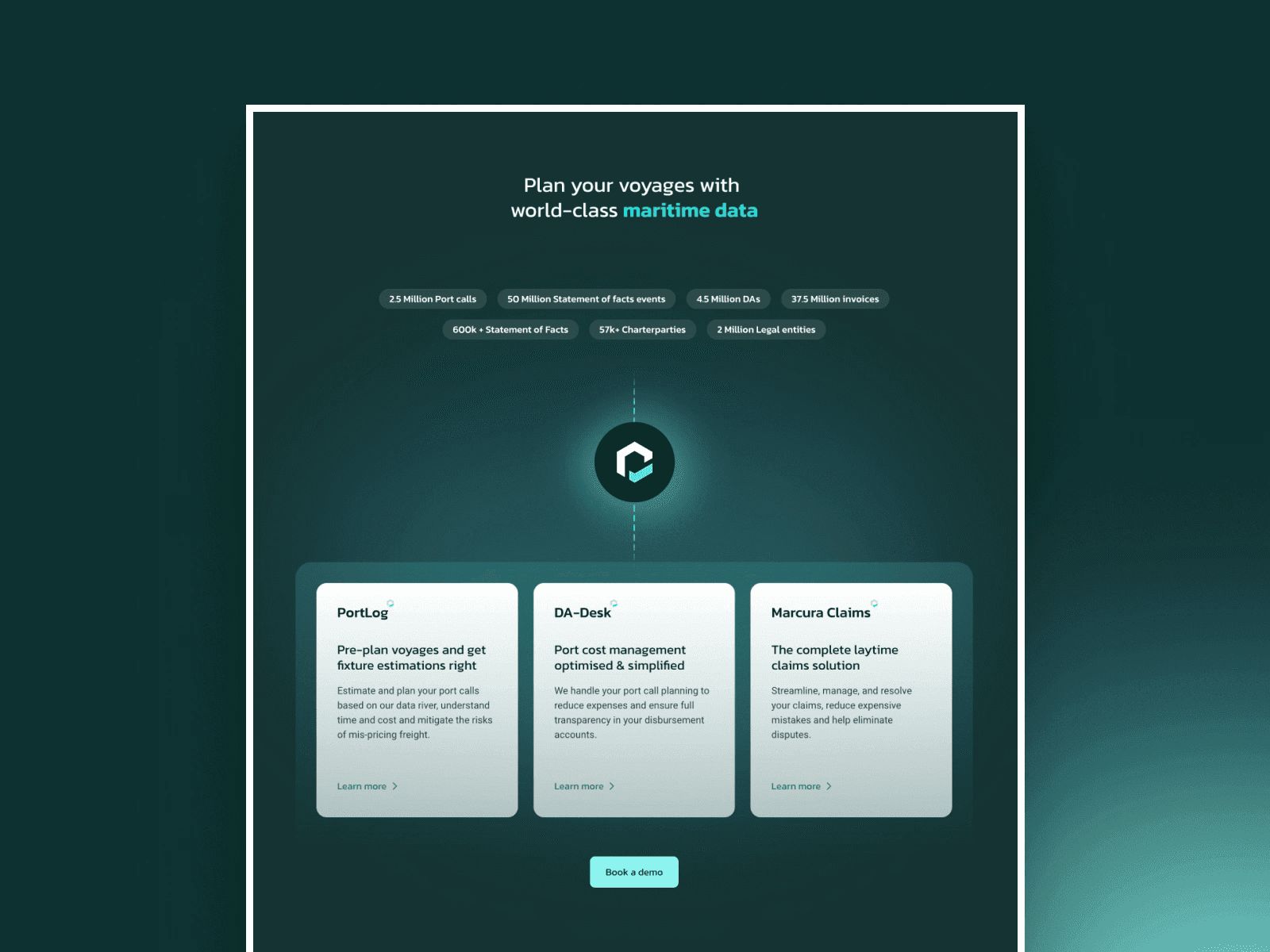
Marcura needed a serious upgrade. Their old site didn’t reflect the scale or credibility expected from a leading B2B fintech in the maritime space. It felt dated, cluttered, and lacked the trust signals enterprise clients look for. The redesign focused on clarity, confidence, and control. We simplified the layout, emphasized hierarchy, and highlighted their expertise without overwhelming users. The result is a bold yet measured interface that supports Marcura’s positioning and future growth. Fun fact: the layout spacing was inspired by global shipping lanes. and it actually worked. Design nerd win.